Card
Cards are used to group related content and actions into a single container. They help organize information into digestible blocks for users.
1. Basic Card
The standard card used for general content blocks. It uses a white background, subtle shadow, and 8px border radius.
Card Title
This is a standard Sport Wales card component. It uses the .sw-card class for consistent padding and rounded corners.
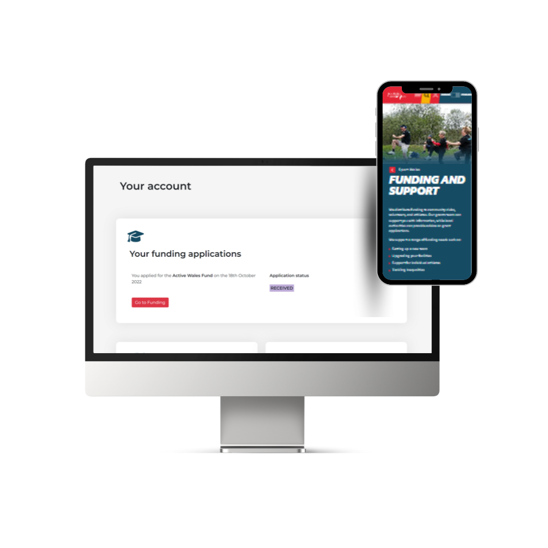
Read more2. Card with Image
Used when visual context is required. The image is cropped to fit the top of the card while maintaining the 8px radius.
News Highlight
Cards can include images at the top to provide visual context for articles or projects.
Read more3. Solid Green Featured Card
A high-impact variant designed for single-column layouts. Unlike standard cards, this uses sharp corners and the brand teal background.
Support for clubs
Find out how we can help your community club grow with our specialized resources and guidance.
When to use cards
Cards are the primary way to group content. Use them when:
- Presenting a collection of items in a grid (e.g., blog posts, staff profiles).
- Providing a clear entry point to further information.
- Highlighting a single, high-importance call to action using the Featured variant.
Sport Wales Guidelines
- Radius: Standard cards use 8px rounded corners. Featured cards (Green) use sharp 0px corners.
- Typography: Headlines in standard cards use sentence case; Featured cards use Uppercase.
- Elevation: Use subtle shadows (`shadow-md`) on white backgrounds to ensure the card stands out from the page.
- Buttons: Ensure buttons within cards follow the Sport Wales height (46px) and color standards.